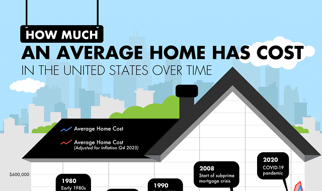
As an app that creates study tools, Brainscape has a particular interest in changes in attention span over time. Their tools are meant to help people improve their attention spans and the data collected shows that it worked! It’s no secret that the general public’s attention span has taken a sharp turn for the worse. The statistics here show the shrinking number of minutes, even seconds people can hold their attention on a given subject. But the company found that people who use their app are using it for longer and longer stretches of time, suggesting that their attention is improving.
The pharmaceutical market is one of the largest industries in the United States. Looking at this infographic from NY Requirements can give us a lot more insight into which drugs are used most often, as well as which illnesses affect us the most. From the graph, we can infer that Americans are at high risk from heart disease. Cardiovascular medications are prescribed more than any other category, claiming many spots all over the list. Here are the top prescribed medications:
If you’ve bought or sold a home in the past few years, you know that the housing market has been through some massive changes. As you can see from this graphic by Madison Trust Company, we are at an all time high in average American home costs. The graphic shows average costs year by year since 1963. This big picture shows us just how dramatically the housing landscape has changed over the decades.
There are many dog breeds today that were bred with an explicit purpose. Bully breeds are the most prominent example of this. Initially created to be protective dogs used for hunting and in fighting contexts, bullies have grown beyond their initial purpose. Known now for their wrinkled faces, strong and stocky stature, and short-coats, they’re very recognizable.
When cell phones first became popular, there were a number of carriers to choose from. You might remember popular options like Cricket, Cingular, Vodafone, Sprint, and Mint. These companies are a thing of the past. So, what happened? The team at Wyoming Attorney LLC gives us the answer with his illustrated chart of telecommunication company mergers.
Many people place a high value on customer service. Who doesn’t like working with staff members that are friendly, knowledgeable, and go above and beyond to make our experience with the business a good one? It can be difficult to judge who offers the best customer service, but not anymore thanks to this Qualtrics infographic. The team used three surveys across a huge number of industries to find the best customer service options. Here are some of the winners in each industry:
When examining schools across the United States you’ll find that spending per student can vary a lot per state. The research from PlaygroundEquipment.com illuminates high and low spending across the nation. They sorted data to determine which states and even which districts spend the most and the least money per student.
What traits do the oldest people worldwide share? Madison Trust Company might have dug up answers with its insightful map displaying nations that have substantial populations aged 65 and older.
Look more into each age bracket with data divided into cohorts of 65-74, 75-84, and 85 and beyond. You’ll find that Japan has the highest elderly population whether you’re examining the oldest or youngest end of the elderly spectrum.
The team at Qualtrics have created a fascinating timeline that gives insight into how the gender pay gap has changed year by year since 1960. The gender pay gap reveals the differences between male and female salaries. The team compared both average yearly salaries and the amount women make to a man’s dollar. These statistics are usually gathered while comparing equally qualified individuals in the same job positions.
Crayola has been inspiring young artists for over a century with their collections of vibrant crayons. These crayons are used to teach children how to identify colors with their fun names and bright labels. In tribute to a brand that’s been so important to kids since 1903, AAA State of Play created this beautiful infographic displaying every color that Crayola has ever created. There are plenty of discontinued sets like glitter crayons, neon crayons, and even multi-colored crayons, but this chart has captured them all.
Subscribe to:
Posts (Atom)