YouTube Introduces New UI Updates Including ‘Pinch to Zoom’ and Other Visual Elements - Visualistan -->

    Social Items


YouTube has made some improvements to the app’s performance and display with new UI updates. First and foremost, YouTube users can now zoom in on videos with a pinch motion.


Next, what YouTube calls ‘precise seeking’ is a new functionality that allows you to drag or swipe through a video while a row of thumbnails displayed below the video player guides you to get to the exact part that you want to watch in a video.


As for improved visual presentation, YouTube has launched the ‘Ambient Mode,’ that makes the color of the app’s background to adapt to the color of the video on your screen. The reason why this could be helpful is because it makes the main content stand out better. “We were inspired by the light that screens cast out in a darkened room and wanted to recreate the effect so viewers were drawn right into the content and the video takes an even greater focus on our watch page,” YouTube explains.


And for the Dark Mode lovers out there, YouTube has launched a darker mode of the functionality, enabling you to experience more vivid colors on the app.


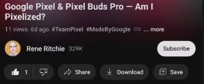
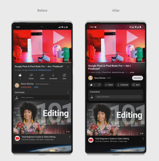
Other minor tweaks introduced to the app include changes in formats. The links in video descriptions have been converted to buttons, while formats of the Like, Share, Download and Subscribe buttons have also been altered to reduce distraction in playback. The most significant change among these is the Subscribe button losing its signature red color, which may also make it less likely to be spotted. Lastly, the color of hashtags has been changed to white from blue.  


YouTube Introduces New UI Updates Including ‘Pinch to Zoom’ and Other Visual Elements


YouTube has made some improvements to the app’s performance and display with new UI updates. First and foremost, YouTube users can now zoom in on videos with a pinch motion.


Next, what YouTube calls ‘precise seeking’ is a new functionality that allows you to drag or swipe through a video while a row of thumbnails displayed below the video player guides you to get to the exact part that you want to watch in a video.


As for improved visual presentation, YouTube has launched the ‘Ambient Mode,’ that makes the color of the app’s background to adapt to the color of the video on your screen. The reason why this could be helpful is because it makes the main content stand out better. “We were inspired by the light that screens cast out in a darkened room and wanted to recreate the effect so viewers were drawn right into the content and the video takes an even greater focus on our watch page,” YouTube explains.


And for the Dark Mode lovers out there, YouTube has launched a darker mode of the functionality, enabling you to experience more vivid colors on the app.


Other minor tweaks introduced to the app include changes in formats. The links in video descriptions have been converted to buttons, while formats of the Like, Share, Download and Subscribe buttons have also been altered to reduce distraction in playback. The most significant change among these is the Subscribe button losing its signature red color, which may also make it less likely to be spotted. Lastly, the color of hashtags has been changed to white from blue.  


Related Post

Disqus Codes
  • To write a bold letter please use <strong></strong> or <b></b>
  • To write a italic letter please use <em></em> or <i></i>
  • To write a underline letter please use <u></u>
  • To write a strikethrought letter please use <strike></strike>
  • To write HTML code, please use <code></code> or <pre></pre> or <pre><code></code></pre>
    And use parse tool below to easy get the style.
Show Parser Box

strong em u strike
pre code pre code spoiler
embed

Subscribe Our Newsletter

Notifications

Disqus Logo