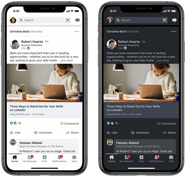
LinkedIn has finally introduced Dark Mode for its mobile and
desktop versions. Dark mode has become a popular choice among social media users as it reduces
strain on the eyes by limiting blue light exposure, and also appears cooler.
LinkedIn described two of the main elements that its Dark Mode is based on: accessibility and inclusivity. The accessibility aspect offers contrast ratios for better text legibility and user interface controls to accommodate the light to dark background contrast. The inclusivity of this feature contributes to bring together LinkedIn’s diverse communities by introducing dark mode versions of LinkedIn’s illustrations. The illustrations represent professionals of various backgrounds across LinkedIn.
Other steps taken by LinkedIn to promote accessibility and
inclusivity include improved text scaling processes, optimal device orientation
switching, updated page reflow, and others.
Dark mode is also a better screen display option as it saves
you from reduced production of melatonin leading to a disrupted sleep cycle,
which is another side effect of exposure to blue light. Apart from offering
health related benefits, dark mode also appears aesthetically pleasing and
gives off a cool vibe.
The Dark Mode option on LinkedIn has started to roll out to
users, although the company hasn’t revealed the date for a full launch.


