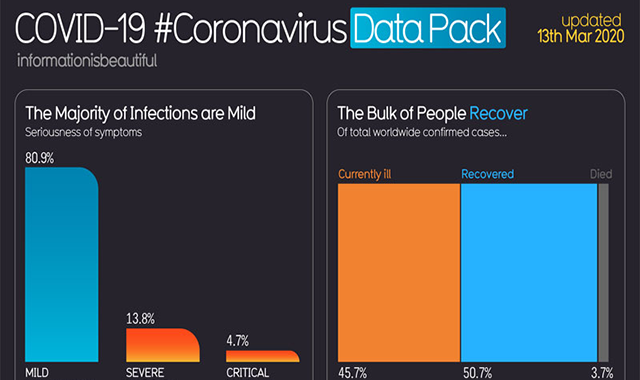
The first graph is a bar graph showing that 80.9% of novel cases of coronavirus are moderate, 13.8% are serious, requiring hospitalization and 4.7% are critical, requiring intensive care. Every graph in the data pack features a headline such as "The Majority of Infections Are Mild," and "The Majority of People Recover." The pushback comes from those who think the headlines and statistics are deceptive, and draw attention away from the real problem: health care facilities get overloaded as a result of too manyCovid-19 patients.
infographic by: informationisbeautiful.net


